We spend $9tn on healthcare globally, or >10% of global GDP. Higher healthcare spend is associated with increased life expectancy and improved quality of life - but healthcare spend in particular is seeing very high inflation. Additionally, many countries are resource constrained both by capital and knowledge, and require significant improvements to improve disease burdens.
This week, we chop up healthcare spend by payer (public vs. private), condition (highest medical issues), and prevention (compared to reactive spend).
At Eka, we are excited about moving spend towards prevention, earlier diagnostics, and lower impact treatments. We view ‘high impact’ businesses here as addressing length of life, quality of life, and ‘equality’ of quality of life.
Putting a price on healthcare 🗞️
We spend $9tn on healthcare globally…
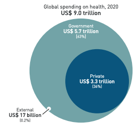
The WHO estimates that we spend $9tn on healthcare across the world, or 11% of global GDP. This exact figure varies by individual country income levels, as shown in the breakdown below by income quartiles.
Covid-19 had a large impact on the rise of healthcare spending in 2020-21. Much of this was driven by government spending with average per capita public spending on health reaching an all time high (more on that later).
By contrast, out-of-pocket private spend fell. One theory is that higher public healthcare utilisation drove down the need to access private healthcare.
High spend is associated with much higher life expectancies. But as we’ll see later on, healthcare inflation will lead to pricing out users in out-of-pocket systems, and reforming the way we view reactive vs. preventative healthcare will help smooth healthcare pressures.
For more information: WHO’s 2022 Healthcare Spending Report, Visual Capitalist.
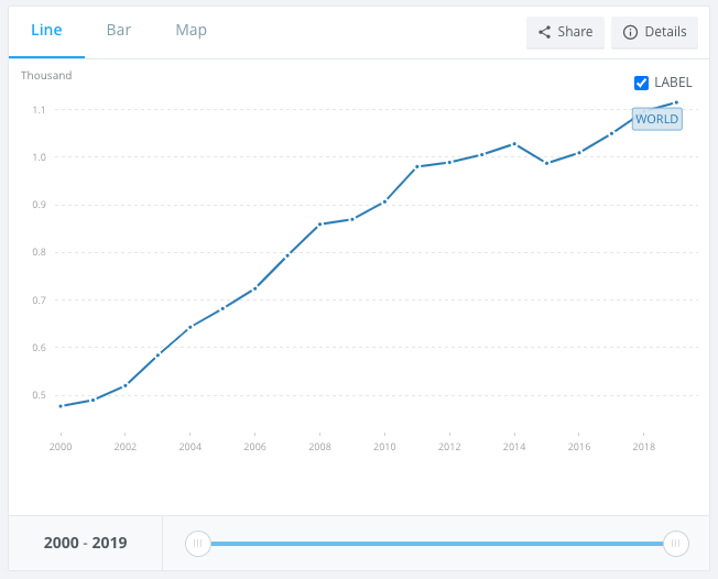
… that breaks down to >$1,100 per person.
The number has been steadily increasing, starting from <$500 in 2000 to $1,115 in the latest 2020 numbers. That’s a a >2x increase in 20 years, compared to a general inflation rate of about 2-3% globally. Additionally, the World Bank data doesn’t yet take into account the high levels of inflation we have been seeing for 13+ months now globally.
The $1,100 figure is not spread evenly across countries. We’ll talk about public vs. private spend in the next section, but this chart is a helpful overview of the biggest spenders on health by country and by wallet.
One final note here - healthcare has been seeing one of the highest levels of inflation across economic sectors. This chart published a few months ago was pretty extraordinary. The reasons include rising labour costs, aging populations, better technology (with higher initial price points), and medical tourism. In other words, structural trends which need longer-term solutions.
For more information: World Bank, OECD Library, Visual Capitalist.
The spend is split across two buckets: $6tn on public, and $3tn on private…
Put another way, 7% of global GDP is on government healthcare systems and the remaining 3-4% is on private systems. As expected, this varies greatly by country.
The United States for example accounts for 44% of healthcare spending, despite only having 15% of the global population. On the other wide, low income countries account for 8% of the world’s population and 0.2% of spend.
We were surprised that US public health spend is now close to 42% of the total national spend on healthcare. This has increased greatly with Medicare and Medicaid since their expansion in 2014 (though the programs had been around since the 1960s). The next largest spend buckets are private health insurance, other payers, and out-of-pocket (albeit this segment is declining).
For more information: Global Health Expenditure Database and Peter Peterson Foundation.
… with the most expensive conditions being Alzheimer’s, Diabetes, and Heart Disease.
There are three ways to look at this: (1) spend per condition, (2) condition prevalence, and (3) quality of life impact per condition.
Spend per Condition
We didn’t find global data on healthcare spend per condition, so are including some US statistics in this section which will invariably be inflated.
Alzheimer’s disease costs the US $321b, diabetes costs $ 237b, heart disease and stroke costs $216b, cancer costs $200b, and obesity is $173b. The numbers won’t line up completely with the total healthcare spend but directionally, that’s 8%, 6%, 5%, 5%, and 4% of the US’s c$4tn total healthcare spend (big!).
The OECD spend broadly tallies this - Germany spends 13% of spend on circulatory issues, 11% on mental health, and 7% on cancer for example. There are some interesting charts linking mortality vs. health expenditure by condition, as published by the OECD (link below).
Condition Prevalence
We once again didn’t find global data by condition prevalence, but look at UK NHS data and Indian healthcare data as a proxy. In the UK, the highest recorded prevalence rates were for hypertension (14%), depression (12%), and diabetes (7%).
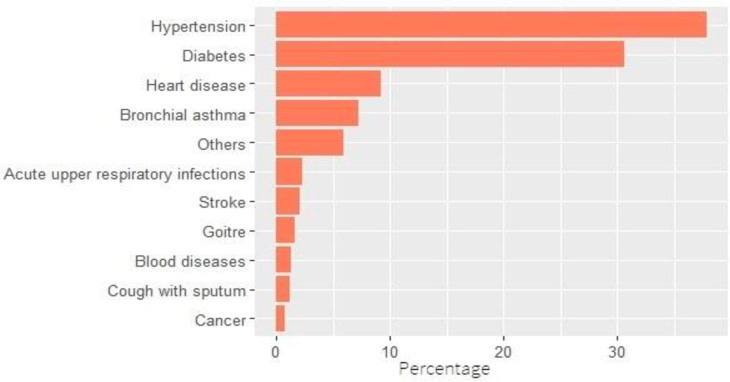
Indian elderly populations also report high rates of diabetes (30%), hypertension (>35%), and heart disease (<10%). Note that this data only looks at the elderly populations compared to the total populations as with the UK dataset.
Quality of Life Impact by Condition
Burden of disease is one way to look at quality of life. By this measure, cardiovascular disease and cancer are the two largest causes of disease burden. They also tend to be more prevalent in higher income countries, as shown by the two previous sections. Neonatal disorders is something we haven’t spoken about previously, and skews towards lower-income countries.
For more information: USC, OECD, NHS, NLM, Our World in Data.
The most impactful statistic for us is only 1% of spend is on prevention.
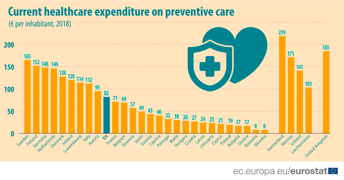
Global statistics vary on how much is spent on prevention as a % of total healthcare spend, but they range between 1-3%. 2018 data suggests many European countries were ahead of this benchmark, with the UK coming in at 5%, and Finland and Italy at 4%.
Put in total $ terms though, we can see that this is still very small compared to the total spend, with the average expenditure being around E80.
Outside of Europe, Canada has one of the highest spends with 6% (note this data source doesn’t tally with Eurostat). The United States is roughly in line with the average.
For more information: Eurostat, Health Tracker
3 Key Charts 📊
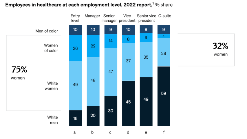
1. Diversity pipeline in healthcare is still struggling
2. Green entrepreneurs are on the rise
3. Tesla’s results show extending margin lead
Deal Capture 💰
Deals in the impact space across the UK and Europe
E-Magy
Silicon startup E-magy raised E15m. Included Invest-NL.
Dexter Energy
Energy forecaster Dexter Energy raised E11m. Led by ETF Partners and Astelia.
Gaussion
Battery company Gaussion raised £2.85m. Led by BGF and Albion.
Pivotal
Biodiversity measurement platform Pivotal raised £4.5m. Led by Octopus
Sunvigo
Solar company Sunvigo raised E20m. Included Future Energy Ventures.
Getting in Touch 👋.
If you’re looking for funding, you can get in touch here.
Don’t be shy, get in touch on LinkedIn or on our Website 🎉.
We are open to feedback: let us know what more you’d like to hear about 💪.


