


10 Charts for February 2025
Issue 112 l Eka’s Weekly Roundup (4 March 2025)

Here are 10 charts which caught our attention last month 👇
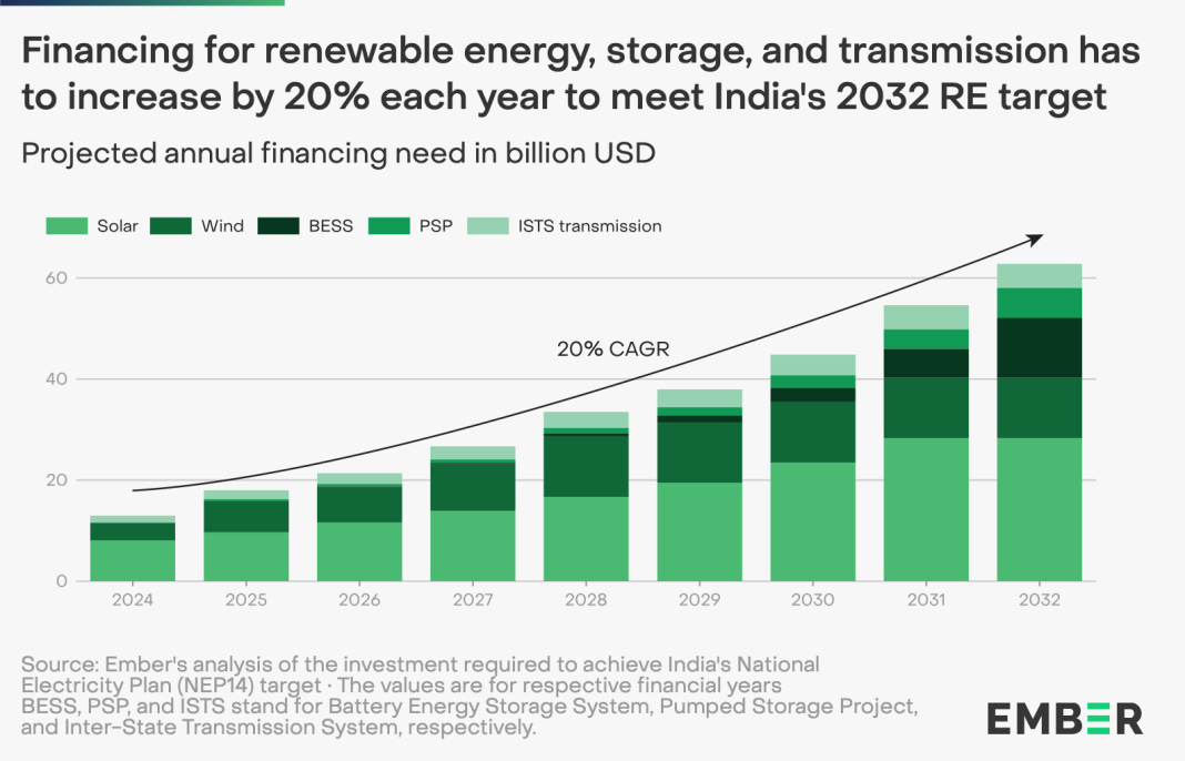
1. India needs >20% year over year spending increases to fund its 2030+ renewable energy targets
2. ‘Average’ year for wildfires.. but zooming into regional trends shows a different story (see link)

3. We love consumer: household spending is still 60%+ of UK GDP

4. Plotting positive vs. negative time impacts for various health technologies (based on staff time impact)

5. Activity levels for 60+ year olds relative to relative risk: who is working out >50m each day?

6. Framework to think about the two types of Gen Zs

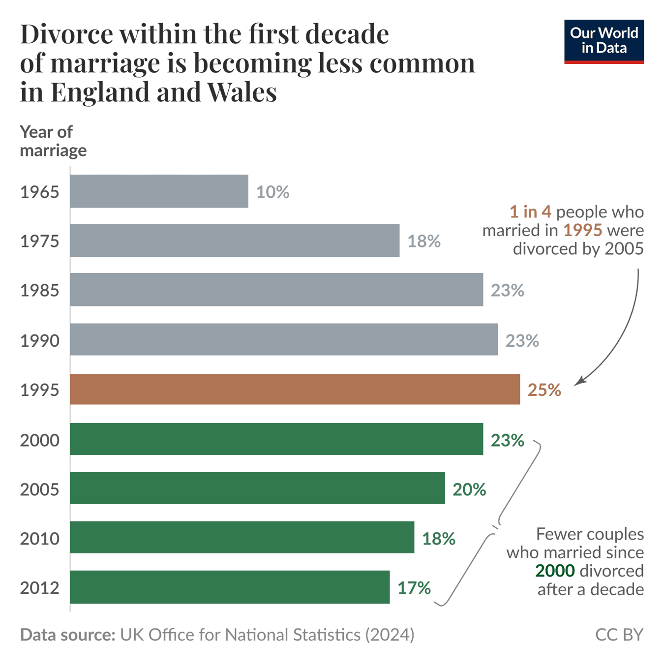
7. Fewer ‘fresh’ divorces in England & Wales: 17% divorce in first 10 years in 2012, compared to 25% in the 1990s
8. Health & Defence spending between 1950s and 2020s (lots of great charts in the Mainly Macro newsletter)

9 “Situationship” with AI companions: one report shows 3 in 4 turning to AI companions at least once a week

10. Caregiver burnout hitting adult carers the hardest (also seen in ONS data)

✍🏽 Week in Impact Articles
Monday: The Platform Evolution Cycle
Tuesday: Tour a British heat pump owner's house
Wednesday: France Bets on Medical AI, to Train 100,000 Doctors Yearly
Thursday: Tech to save time: how the NHS can realise the benefits
🗣️ Review of the Week

👋 Getting in Touch
If you’re looking for funding, you can get in touch here.
Don’t be shy, get in touch on LinkedIn or on our Website 🎉.
We are open to feedback: let us know what more you’d like to hear about 💪.